I still remember standing in my daughter’s bedroom about three years ago, staring at four plain white walls, a hand-me-down dresser we’d spray-painted twice already, and a bed that looked like it belonged in a college dorm rather than a little girl’s room. My budget? A generous $150. My goal? Something that didn’t look like I’d given up.
My neighbor had just posted photos of her son’s “jungle-themed” bedroom on Instagram — the kind you see on Pinterest boards titled “Nursery Inspo 2024” —, and I won’t lie, I felt a little twinge of something. Not jealousy exactly. More like I wish I knew how she did that without winning the lottery.
Turns out, she’d spent about $200. Total. Not on one throw pillow, not on one wall decal — the whole room.
That conversation changed how I approach kids’ room decorating completely. Since then, I’ve done three kids’ rooms (two girls, one boy), helped three friends overhaul their kids’ spaces, and learned — mostly through embarrassing mistakes — what actually makes a room look expensive and what just looks cheap no matter how much you spend.
So here’s everything I know. No fluff, no affiliate-bait, just the real stuff.
Why Kids’ Bedroom Decor Feels So Expensive (When It Doesn’t Have To Be)?
The trap most parents fall into is this: they see a beautifully styled kid’s room in a magazine or on social media, they try to replicate it exactly, and they end up spending $800 on things that either get destroyed in two months or get “outgrown” before the school year is out.
Here’s what I’ve learned: the rooms that look the most expensive usually aren’t expensive at all. They just follow a few specific visual principles that make the brain read “intentional” and “designed” instead of “thrown together.”
The secret is in the layering — texture on top of texture, colour in the right places, and a sense that someone thought about this. You can create all of that on a shoestring budget. I’ve done it. Let me show you exactly how.
Idea 1: Create an Accent Wall with Peel-and-Stick Wallpaper

This was the first trick that made me feel like I’d actually cracked the code.
My son’s room had one feature that made it feel smaller than it was — every single wall was the same flat beige. Identical, uninspiring, institutional. The kind of colour that makes you feel like you’re waiting for a bus.
I spent about two weeks scrolling through peel-and-stick wallpaper options on Amazon and Etsy before landing on a simple geometric pattern in navy and white. Cost: $34 for one wall. Application time: one Saturday afternoon with a squeegee and a lot of patience.
The result looked like something out of a West Elm catalogue.
Here’s how I do it step-by-step:
Pick just ONE wall — the one behind the bed head is almost always the right choice. Doing all four walls can feel overwhelming and actually makes a small room look smaller.
Measure carefully before ordering. I always order about 10% extra because kids’ rooms are rarely perfectly square, and you’ll want overlap.
Clean the wall with a slightly damp cloth and let it dry completely. This took me a full 24 hours once because I rushed it the first time and got bubbles everywhere. Never again.
Start from the top, use a level or plumb line so your pattern lines up straight, and work in sections. Smooth with a credit card or squeegee as you go.
The brands I’ve personally used and liked: Tempaper (mid-range, very easy to remove), WallsNeedLove on Etsy (more affordable, great patterns), and the Amazon generic options work fine for geometric shapes but can be trickier with photo-realistic prints.
The reason this looks expensive: a feature wall immediately reads as “designed” to the eye. It creates a focal point, which tricks the brain into thinking the whole room has been styled.
Avoid this mistake: don’t go for anything too trendy. I put a cactus print in my daughter’s room in 2019, and she was over it by 2021. Stick to timeless geometric shapes, stripes, or subtle textures.
Idea 2: Swap Out Hardware — It’s the Jewellery of a Room

This one is so easy that I’m almost embarrassed I didn’t figure it out sooner.
When we moved into our current house, my older daughter’s dresser and wardrobe had the original builder’s hardware — those flat, stamped-metal handles you see on absolutely every rental property on the planet. The dresser itself was fine. Actually, it was a really solid piece of timber. But those handles dragged the whole room down.
I spent $22 on ceramic knobs from a small shop on Etsy — painted with little flowers, in a cream and sage colour palette that matched the rest of the room.
My mother-in-law came to visit two weeks later and asked if we’d bought a new dresser.
We hadn’t. We’d just changed the handles.
What to look for:
You want hardware that has some visual weight to it — ceramic, brass, or resin rather than thin stamped metal. Look for something that tells a little story: a small animal shape, a hand-painted pattern, a colour that’s pulled from somewhere else in the room.
Etsy is genuinely the best place for this. Search “ceramic drawer knobs kids,” and you’ll spend a happy hour falling down a rabbit hole. Prices range from about $2–$8 per knob, depending on the seller. For a 6-drawer dresser, you’re looking at $12–$50 total. That’s it.
The standard fitting is usually a 32mm hole spacing for handles or a simple screw-through for knobs. Measure before you buy, or you’ll end up with knobs that don’t fit, which I have done twice.
Idea 3: Layer Rugs for Texture and Warmth

Most kids’ rooms have one rug or no rug. The rooms that look designed almost always have layered textiles on the floor.
Here’s my cheap version of this look:
Start with a flat, neutral base rug — a simple jute or sisal rug, or even a solid-coloured flatweave. These are inexpensive. IKEA’s LOHALS jute rug is about $40 for a decent size. A striped cotton flatweave from IKEA can be even less.
Then layer a smaller, more interesting rug on top. This is where you put the pattern, the colour, the personality. Faux sheepskin, a round colourful kilim-style rug, a pom-pom rug — whatever fits the room’s theme.
The smaller top rug can come from anywhere. I’ve found beautiful ones at TJ Maxx, at markets, even in the home section at Target. You’re looking at $15–$40 for something that feels genuinely special.
The reason this works: layered rugs add visual depth and make a room look intentionally styled. It’s something you see in high-end interior photographs all the time, but the actual cost is minimal because the base layer doesn’t need to be beautiful — it just needs to be the right size and a neutral colour.
One thing I got wrong the first time: I used a fluffy shag rug as the base and a flat rug on top. It was a trip hazard, and the top rug slid around constantly. Base layer flat, top layer can be fluffy — that’s the rule.
Idea 4: Go Big (or Go Home) with Curtains

I cannot overstate how much curtains matter.
In every single kids’ room I’ve helped style, swapping out short, flimsy curtains for long, floor-to-ceiling ones was the single biggest change in how “done” the room looked. It’s architectural. It changes the proportions of the entire room.
The trick: hang the curtain rod much higher than the window frame — ideally close to the ceiling — and let the curtains puddle slightly or just kiss the floor. This makes the ceilings look higher, the windows look bigger, and the room look like it cost significantly more than it did.
For fabric, you don’t need to spend much. IKEA’s SILVERLONN blackout curtains are excellent and inexpensive (bonus: blackout curtains mean kids actually sleep, which is priceless). Dunelm, Target, and even Amazon have linen-look curtains in white, cream, and soft colours that photograph like they’re from a boutique home store.
The rod matters too. Skip the plastic tension rods and get a simple metal rod with finials — the round brass kind from IKEA looks far more expensive than they are and costs about $12.
One mistake I see constantly: parents buying curtain panels that are the exact height of the window. They look like they’re wearing high-waters. Always go floor-to-ceiling, always hang the rod high.
Idea 5: DIY a Gallery Wall with a Mix of Frames
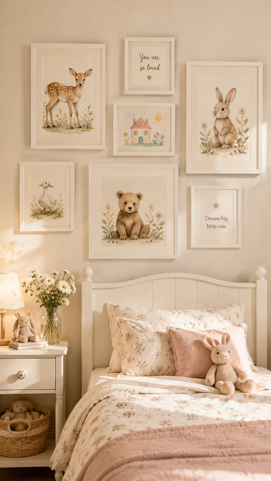
A gallery wall is one of those things that looks expensive and effortful but is actually neither, once you know the formula.
The formula: mix frame sizes, keep frames the same colour (all white, all black, or all natural wood), and mix the content — not all photographs, not all prints, but a combination.
In my daughter’s room, I did: two framed watercolour prints I found on Etsy for $4 each as digital downloads (printed at my local print shop for about $3 each), one framed child’s drawing of our cat, one simple piece of text art I made in Canva (completely free), and two circular wicker frames I found at a market for $2 each.
Total cost for the whole gallery wall: $26.
I get asked about it every time someone comes to the house.
Step-by-step for a no-fail gallery wall:
Lay all your frames out on the floor first and arrange them until you’re happy. Take a photo on your phone so you don’t forget the arrangement.
Cut pieces of paper the size of each frame and tape them to the wall with painter’s tape to map out your arrangement before hammering anything. This saves you from twelve nail holes and a lot of frustration.
Start with the largest frame and work outwards. Keep the spacing consistent — I use about 5–7cm between frames.
For digital prints, my go-to is searching Etsy for “kids’ room printable art” — thousands of options, most under $5, and you can print at the exact size you need. Kmart and IKEA both have affordable frames that work well.
Idea 6: Use Fairy Lights as Architecture
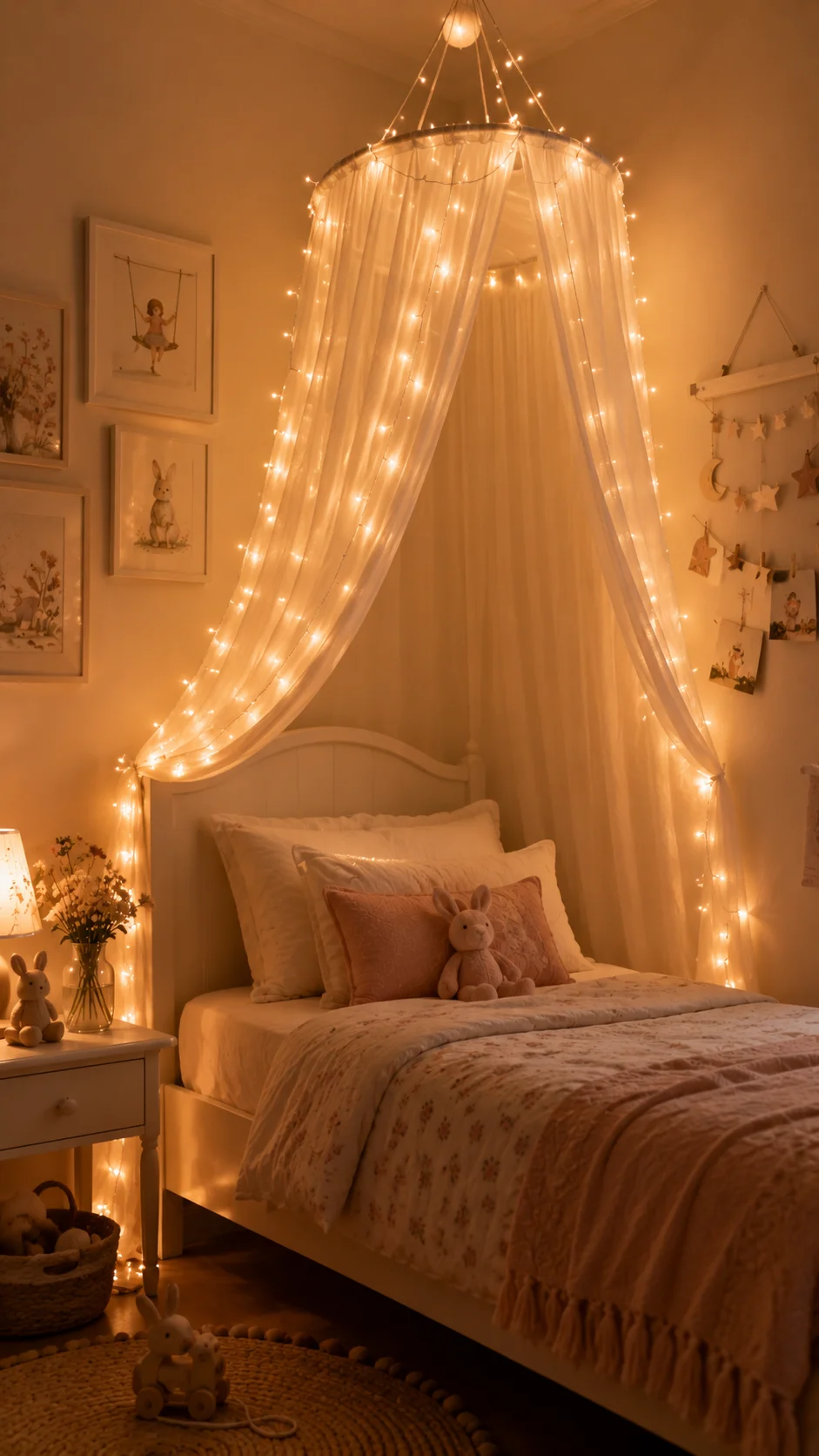
This is the one my kids request every time.
Fairy lights — the warm white kind, not the rainbow blinky ones — draped thoughtfully around a room do something genuinely magical. They add warmth, dimension, and that slightly dreamy quality that makes a kids’ room feel cozy rather than just functional.
But there’s a right way and a wrong way to do this.
The wrong way: just draping a string across the wall randomly. It looks like you haven’t unpacked from camping.
The right way: use fairy lights to frame or highlight something that already exists. Frame the window. Follow the outline of a canopy above the bed. Run them along a shelf to make the shelf feel intentional. Wrap them around the headboard.
I used copper-wire fairy lights (the very thin wire kind, not the thick plastic-coated ones) from Amazon — about $10–$14 for a 10-metre string with a USB power adapter. I pinned them along the top edges of a canopy I’d made from a simple embroidery hoop and some IKEA sheer fabric, and the whole setup cost under $25.
The result looked like something from a boutique children’s furniture store.
The USB power is important — you want to be able to plug it in at bedtime and unplug it safely. Look for ones with a timer function so they turn off automatically.
Idea 7: Add a Reading Nook (It’s Easier Than It Sounds)
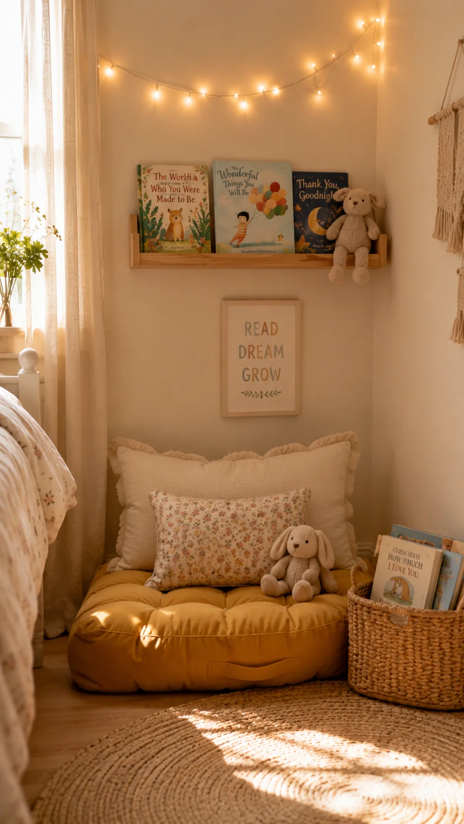
Every time I see a kids’ room that makes me stop and stare, there’s usually a nook involved. A little dedicated space within the space — a corner with a cushion and a shelf, an alcove with a curtain, a tent in the corner — that gives the room personality and purpose.
You do not need to renovate your house to create this.
My cheapest version: I bought a floor cushion from IKEA (POÄNG floor cushion, about $25), added a small floating shelf above it from Kmart for $12, put a simple string of fairy lights above the shelf, and added a small wicker basket for books on the floor beside it. I used a $6 tension rod and a piece of fabric ($8 from a fabric shop) to make a simple curtain across the corner for privacy.
Total cost: under $60 for a genuine reading nook that my kids fight over.
The key to making it look expensive rather than patched together is keeping it cohesive — the same colour palette as the rest of the room, the same style of shelving. If everything else is natural wood and white, don’t use a bright red basket in the nook.
A common mistake: making the nook too small. Kids need enough space to actually lie down comfortably. Measure before you commit to the cushion size.
If your room has an existing alcove or under-stair space, even better — add built-in-looking floating shelves (IKEA LACK shelves are excellent for this) and suddenly it looks architectural rather than improvised.
Idea 8: Commit to a Colour Palette (Three Colours Maximum)
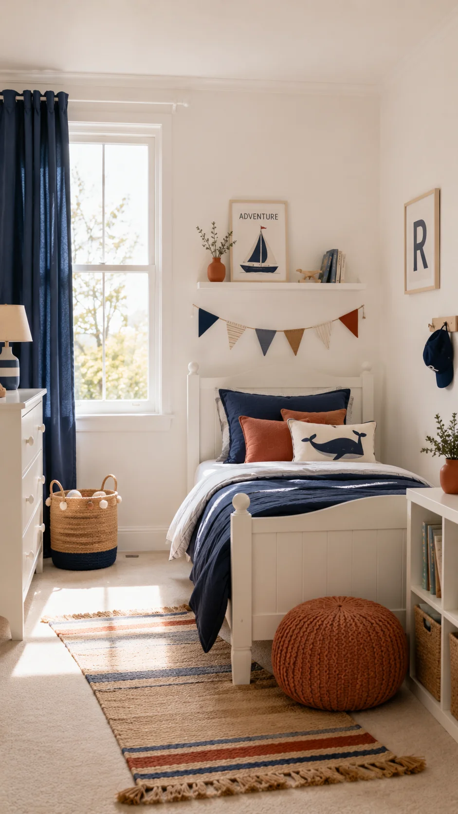
This is the thing that separates rooms that look expensive from rooms that look cluttered, and it costs absolutely nothing.
A colour palette.
Pick three colours. That’s it. One dominant colour (usually the walls or a large piece of furniture), one secondary colour (used in textiles — curtains, bedding, cushions), and one accent colour used sparingly in small details.
In my son’s current room, it’s: white (dominant — walls and furniture), navy (secondary — curtains, bedding, rug), and terracotta (accent — a few cushions, a small vase, the fairy light wire).
Every single purchase I make for his room goes through this filter: Does it fit the palette? If it doesn’t, it doesn’t go in the room, no matter how much he loves it in the shop.
This one rule makes more difference than almost any purchase you can make.
The mistake I made in my older daughter’s first room: I just bought things I liked, in colours I liked, without thinking about how they’d work together. The room had yellow curtains, a pink rug, purple bedding, and green walls. Each thing was fine on its own. Together, it looked like a birthday party had exploded.
Starting over with a three-colour limit transformed everything.
How to pick a palette:
Start with the thing you’re least likely to change — usually the walls or the largest piece of furniture. Then choose a second colour that works with it (Pinterest’s “colour palette generator” or Adobe’s Color tool is free and excellent for this). Then pick an accent that adds warmth or energy — usually something from the opposite end of the colour wheel.
Write them down. Keep the note in your phone. Refer to it every time you’re tempted to buy something with an unrelated colour.
The Mistakes I Made (So You Don’t Have To)
After three full room makeovers and years of helping friends, here are the biggest — and most expensive — mistakes I’ve made.
Buying too small. A 120cm rug looks lost in most kids’ rooms. I have bought the wrong rug size so many times. Measure the space before you buy anything.
Matching everything too perfectly. Rooms where every single thing matches look flat and staged rather than lived-in. Mix textures, mix slightly different shades of the same colour, and let a few things be unexpected.
Ignoring lighting. Most kids’ rooms have one overhead light, and most overhead lights make rooms look clinical and flat. Add a lamp. Add fairy lights. Add any secondary light source. It makes a bigger difference than almost any other change.
Following trends too closely. I put a llama print border in a room in 2018. Enough said.
Spending too much on things kids will destroy. Light-coloured velvet cushions in a six-year-old’s room are not a good decision. I know this now.
Trying to do everything at once. The best-looking rooms I’ve put together have been layered over time — one good change, then another, then another. Rushing it usually means buying things in a panic that you later regret.
A Few Tools and Apps I Actually Use
Canva (free): for making printable wall art, labels for shelves and baskets, and little personalised touches like a name sign.
Pinterest: still the best mood-board tool available. Make a board for the room before you buy anything and check every potential purchase against it.
IKEA Place App: lets you see IKEA furniture in your actual room using augmented reality before you buy. I’ve saved myself from at least three wrong-sized purchases using this.
Marketplace/Facebook: for finding second-hand pieces to paint or upcycle. I’ve sourced the bones of two full room makeovers from Marketplace for under $80 total.
Etsy: for printable art, unique hardware, and the kinds of small details that make a room feel genuinely individual.
Bringing It All Together
The through-line in all of these ideas is the same thing: intention.
An expensive-looking room isn’t expensive because the things in it are expensive. It’s expensive-looking because someone thought carefully about what went in and what didn’t. Every element serves the palette, the feeling, the purpose of the room.
You can do that with $150 and a Saturday afternoon.
Start with one wall. Change the hardware on one dresser. Add one layer of curtains hung at the ceiling. Buy an interesting rug from a market. Make one gallery wall from digital prints and second-hand frames.
Do those five things in a room that’s currently giving you nothing, and I promise you’ll stand in the doorway and feel that little spark of oh, this is actually really nice.
That feeling doesn’t cost much. It just takes knowing where to look.
Have you tried any of these in your own kids’ room? I’d genuinely love to hear what worked — drop it in the comments below. And if you’re standing in a room right now feeling overwhelmed, just start with the curtains. Seriously. It changes everything.

Shahid Nawaz is a home and garden content writer at Garden Skillz with over 4 years of experience researching and writing about gardening, plant care, and DIY home improvement. He specializes in turning complex horticultural topics into practical, easy-to-follow guides for beginners and experienced growers alike. Shahid has written extensively on flowering plants, indoor greenery, and seasonal garden care.